
Building Funished UI Design With Angular Material Design
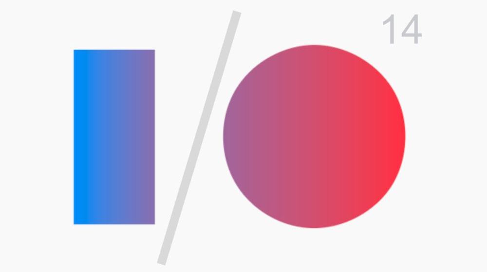
Design is the part of software or application development that requires some natural insight from the developer. Some people will say: "we are born designer, we don't become designers". This is where the material design comes into play. The mega tech company in the name of Google introduced the google material design in June 2014 during the I/O Conference.
Material design is a design concept introduced by google to fill the gap of the saying of on people born as designers. It's actually a set of prebuilt common UI components that was built following the most optimal design standards and principles.
In this article, we will introduce you to angular material design which is actually a version of material design built specially for the angular framework. Since the release of angular 6, it has come with a very nice feature that completely eases the setup and the usage of angular material design. that feature was named angular material design schematics.
Installing Schematics
From version 6, angular cli comes packaged with schematics to install angular material design by running a single command as shown below.
This will install the material design package and all the dependencies needed like @angular/cdk and @angular/animations. Running this command will also make sure all the related updates have been made as stated below.
-
Ensure project dependencies are placed in
package.json -
Enable the BrowserAnimationsModule in your app module
-
Add either a prebuilt theme or a custom theme
-
Add Roboto fonts to your
index.html -
Add the Material Icon font to your
index.html -
Add global styles to:
-
Remove margins from
body -
Set
height: 100%onhtmlandbody -
Make Roboto the default font of your app
-
-
Install and import
hammerjsfor gesture support in your project
Setup Schematics Components.
In addition to install schematics, angular material comes with multiple schematics commands that can be used to easily generate material design components. Here is the list of all the components come with schematics at the moment I am writing this article.
|
Name |
Description |
|---|---|
|
|
Component with a form group that uses Material Design form controls to prompt for a shipping address |
|
|
Creates a component with a responsive Material Design sidenav and a toolbar for showing the app name |
|
|
Component with multiple Material Design cards and menus which are aligned in a grid layout |
|
|
Generates a component with a Material Design data table that supports sorting and pagination |
|
|
Component that interactively visualizes a nested folder structure by using the |
Additionally the Angular CDK also comes with a collection of component schematics:
|
Name |
Description |
|---|---|
|
|
Component that uses the |
What you will learn from this article
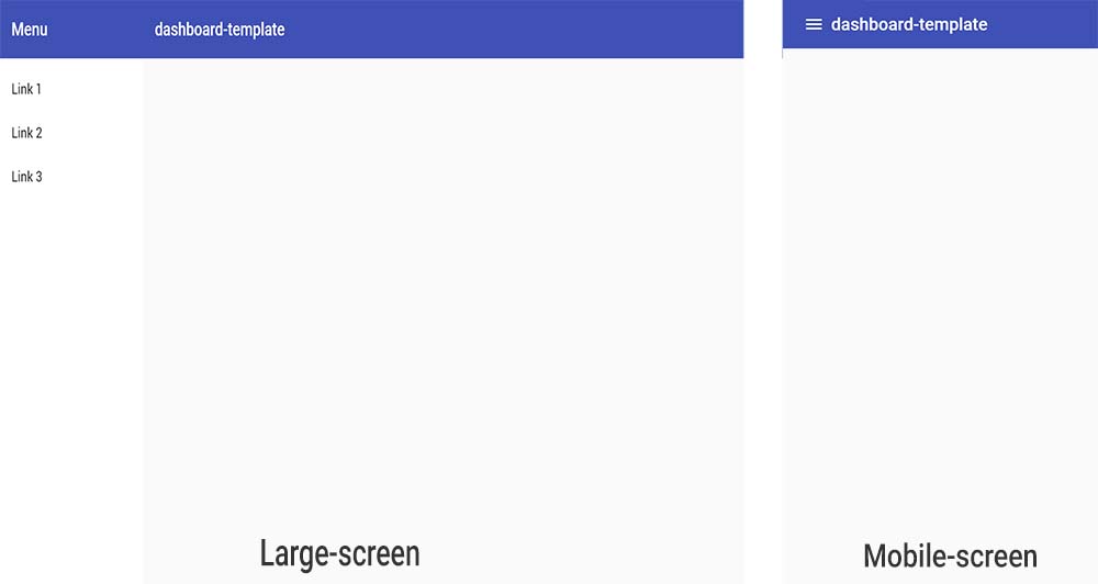
To assimilate this introduction, we will build a light weight dashboard template as shown on the image at the beggining of this article, using these four main components of the schematics feature:
-
navigation
-
dashboard
-
tabble
-
address-form
Building our dashboard-template
As stated earlier, we will have to start by creating our Angular Application and using the angular cli. If you don't know how to use angular cli I will invite you to read the top section of this article to get familiar with it before come back here. So run the following command where dashboard-template is the name of our angular application.
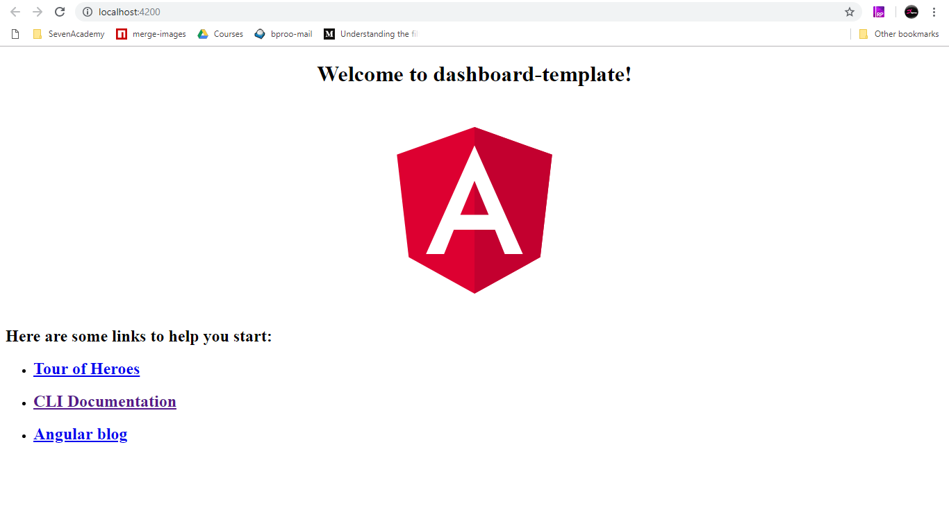
go to the following local address to make sure you app is working well. http://localhost:4200/
if everything is okay, you should have this result.
Installing material design Schematics Component
To install any other schematics component, we must first install the angular material design package via schematics with the followiing command.
As i mentionned before it will install evry needed dependencies as you can see here.
Installing the Navigation Component
At this level it's very simple to add other components with just one command, for the Navigation,we will run the following command where navigation is the name of our component here.
The only thing remaining is to update our code in other for the navigation component to appear. Nothing simple than the normal angular dev knowledge. So, let's replace the content of our app/app.component.html with the following:
and this is the expected output.
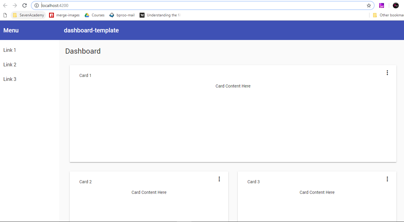
Installing the Dashboard Component
As the previous component, we just run the following command and update the content section of our Navigation component to display our dashboard in tthere.
Now just open the navigation/navigation.component.html and add this code snippet
directly below the comment section that says <!-- Add Content Here -->
that will be all normally you should see this:
Our App Routing
Let's add the routing system in other to be able to Navigate through the pages of our application if you didn't do it while setting up the appplication.
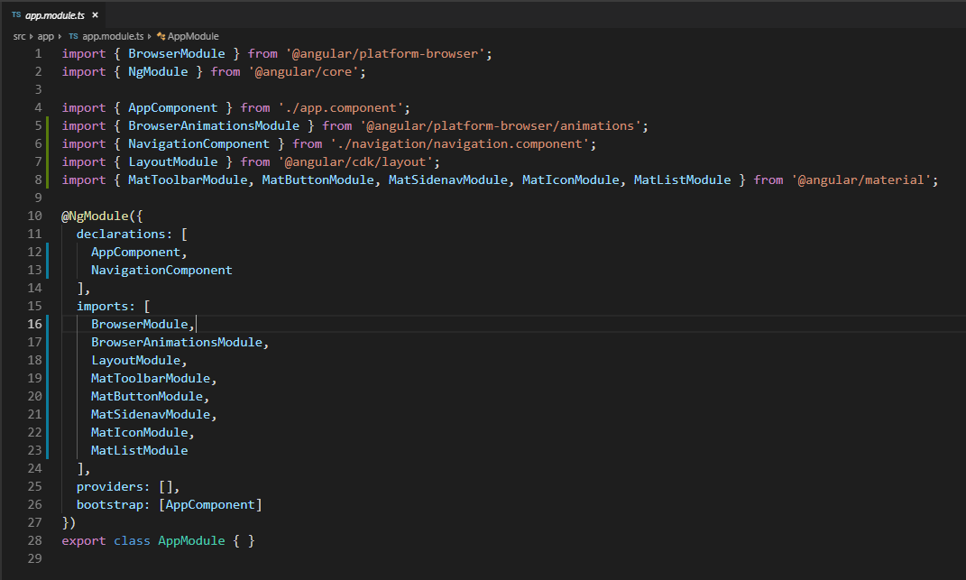
all you need to do is to open app/app.module.ts file and add the lines of code
now update the navigation/navigation.component.html
What to notice here is that, we have updated the <!-- Add Content Here --> section and the mat-nav-list routerLink properties as you can see in the code snippet above.
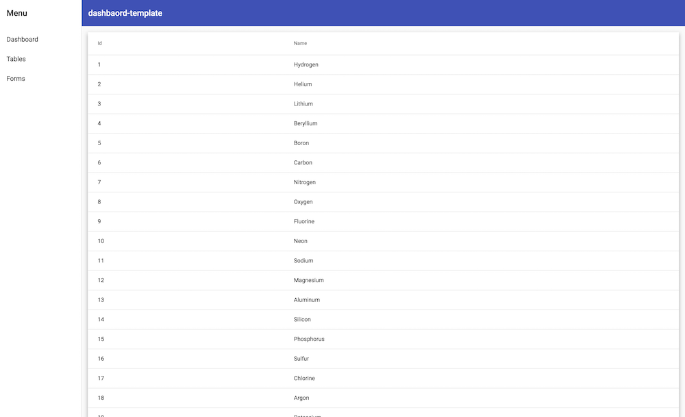
Installing the Tables Component
All we have to do now is to install the component and it will directly show as the route will invoke the component which will invoke the view on it turn.
here is what we have at this stage.
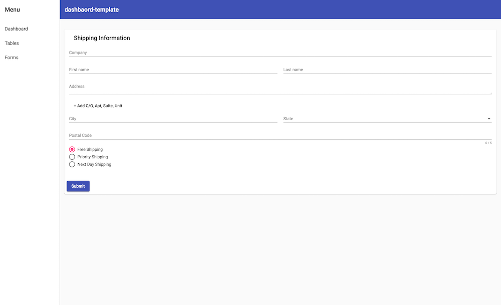
Installing the Forms Component
For this last part this is what we will have after we run the following command.
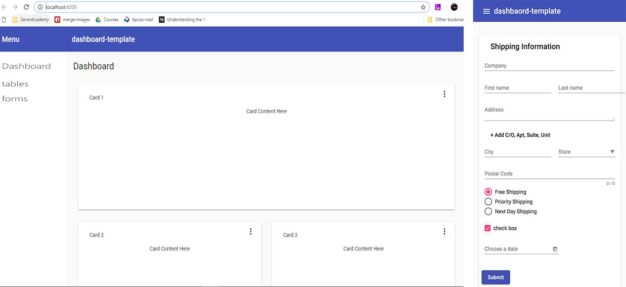
and without editing anything we can have this, when clicking on the form tab of the sidebar of our application.
Adding anyother Material design component
At this level we have not explored all the components of the angular material design framework. You can add any other component, by going to the component tab of their official documentation and following the instructions to import the module from the API and the source code of the of the documentation as shown bellow.
That is all, thank you for reading. We will appreciate if you can share it with friends or in any other platform to help others learning material design.
The complete source code can be found on github here.

Kamdjou Duplex
the world would not be so beautiful without people willing to share knowledge


- 7 years ago
learn how to setup angular 7 and firebase

Save Your Money Today!

By receiving free stock articles and smart tutorials to advance your career.


Save Your Money Today!
By receiving free stock articles and smart tutorials to advance your career...