
AN INTRODUCTION TO RESPONSIVE DESIGN WITH BULMA
What is Bulma?
Bulma is a free, open source framework which is used for creating responsive designs. it is based on the css3 flexbox model and relatively easy to learn.
Why Bulma?
There are many other css frameworks like Bootstrap, Foundation and Material design. Some frameworks are free while others are payed. Choosing and learning the right one might be a quite frustruating. Bulma is outstanding for the various reasons:
- It is lightweight.
- It is free( open source)
- It is very easy to learn
- It has a pretty good documentation
What we would build.
We would build this page from begining to end in this post.
Geting started with bulma
There are many ways to include Bulma framework into your new or old project. I will work you through some of the most used methods.
Step one: Setting up the project
1. To get started create a new folder with the name of you project like "bulma_post" 
2. Open your folder in your prefered text edditor and create and index.html file. I will be using Visual Studio code throughout this post. To link bulma to your project we would be downloading bulma through their official website bulma.io.

3. Click the download button You will see on the website.When the file has finished downloading open the zip and extract the css folder to your project location
4. Go to your index.html file and setup the link to the bulma.min.css
<link rel="stylesheet" href="css/bulma.min.css">Step two: Our project
1. Bulma Navbar: Bulma has some quite easy to remember navbar classes like. navbar, navbar-brand, navbar-item, navbar-menu, navbar-start and navbar-end
The navbar class is the general container(body) of the whole navbar. so in practice
<nav class="navbar"></nav>The navbar-brand is the part of the navbar that contains the logo which is shown no matter the screen size
<nav class="navbar">
        <!-- navbar-brand -->
        <div class="navbar-brand"></div>
    </nav>
The navbar-item is used for elements such as a, imb, span or p. that could be used as items in the navbar.
<div class="navbar-brand">
   <a href="#" class="navbar-item" >Logo</a>
  </div>
The navbar-menu shows the collapsable part of the navbar. usualy the navbar-start and navbar-end are always children of the navbar-menu
<div class="navbar-menu">
        <div class="navbar-start"></div>
        <div class="navbar-end">
     <a href="#" class="navbar-item">links</a>
  </div>
So the code of our navbar for our project will now look like this
 <!-- navbar -->
    <nav class="navbar">
        <div class="container">
            <div class="navbar-brand">
                <a href="#" class="navbar-item" >Logo</a>
            </div>
            <div class="navbar-menu">
                <div class="navbar-end">
                    <a href="#" class="navbar-item">Pages</a>
                    <a href="#" class="navbar-item">Components</a>
                    <a href="#" class="navbar-item">Sign Up</a>
                    <a href="#" class="navbar-item">Log In</a>
                </div>
            </div>

        </div>
    </nav>
The container class is a bulma class used to give some spacing from the left and right of our navbar
Now create and external stylesheet we would be using for our own custom sites
<link rel="stylesheet" href="css/main.css">We now have to style our navbar
.navbar{
border-bottom: 1px solid rgb(201, 201, 201);
background-color: #4829b2;
}
.navbar-item{
color: rgb(236, 234, 234);
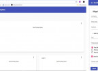
}Our navbar should now look like this
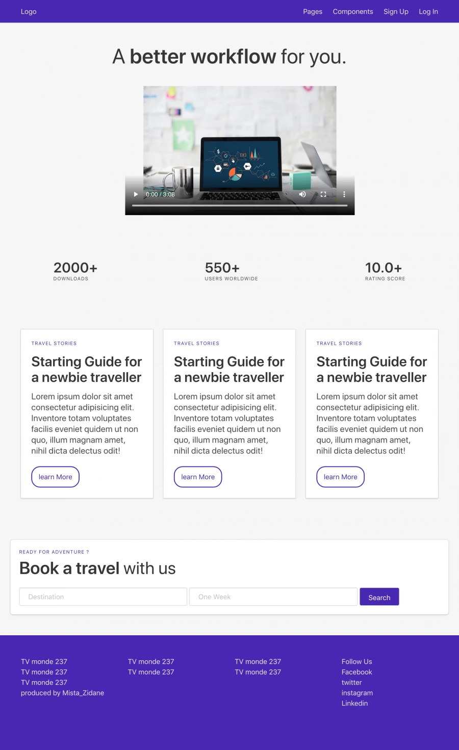
We would divide the body into four sections so as to show how to organise your html layout
- Introduction
- Downloads
- Stories
- Book a travel
Our Introduction section
Bulma has alot of classes used in positioning and styling. In this section we would use the section, container, title, image, has-texted-centered and a few more.
The section is used to position content into "sections" as the HTML tag
<div class="section"></div>In Bulma the H1-H6 elements are displayed thasame if it is not styled either by using a bulma class or something else.The title is used to display a heading while the subtitle is used to display a sub heading. The is-1 to is-6 represents H1-H6 respectively. e.g.
<h1 class="title is-1">your text</h1>The Image class is used mostly and preferably on a figure element which inturn contains and image or a video.
<figure class="image">
       <img src="" alt="">
</figure>
The has-text-centered aligns all the children of an element to the center
<div class="has-text-centered"></div>With all this classes our first section is set to go
You can get the files from my github account the link. If you dont know how to use github i sujest you should watch this tutorial. our better still use external links to ur own files.
<div class="section has-text-centered">
<div class="container">
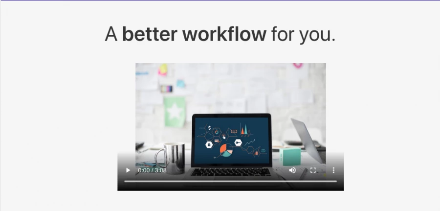
<h1 class="title is-1"> <span class="span-text">A</span> better workflow <span class="span-text">for
you.</span> </h1>
<figure class="image my-image">
<video src="Zlatan.mp4" poster="pic.jpeg" controls></video> <!-- your own links -->
</figure>
</div>
</div>Now you would see a two external classes. the code is to position the figure and give special styles to the text in between the span tags
.span-text{
    font-weight: normal !important;

}
.my-image{
    width: 55% !important;
    margin-left: 25%;
    padding-top: 2%;
    padding-bottom: 5%;
}
Now our introduction section should look like this
Our Downloads section
The main class we would use is the level, level-item and heading
The level class is a which acts as a container for the level-item or other elements
<div class="level">
       <div class="level-item"></div>
   </div>
So the code for our Downloads section now looks like this
 <div class="level my-level">
        <div class="level-item">
            <div>
                <p class="title">2000+</p>
                <p class="heading">downloads</p>
            </div>
        </div>
        <div class="level-item">
            <div>
                <p class="title">550+</p>
                <p class="heading">users worldwide</p>
            </div>
        </div>
        <div class="level-item">
            <div>
                <p class="title">10.0+</p>
                <p class="heading">rating score</p>
            </div>
        </div>
    </div>
The my-level class is used as a custum class to set the padding-bottom
.my-level{
   padding-bottom: 3%;
}
Our Downloads section now looks like this

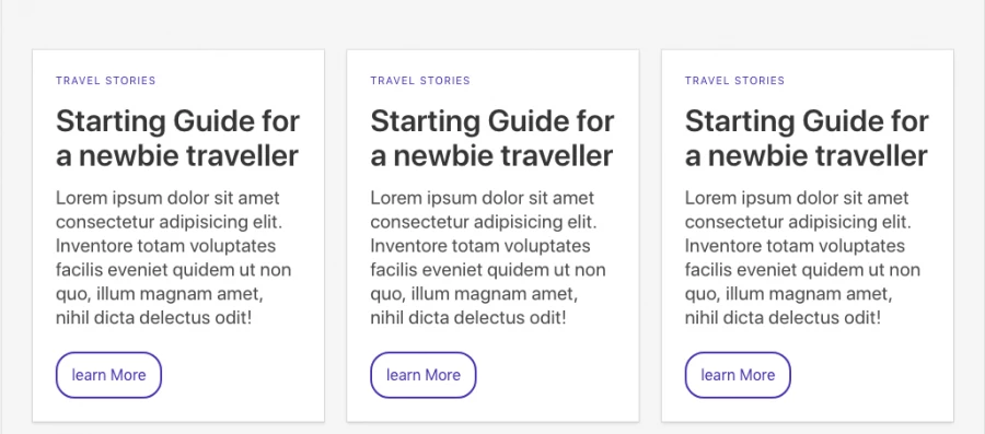
Our Stories section
In this section you will see the Bulma card, and the Bulma Columns. The classes involved are the columns, column, card, and card content.
The Columns class is the main responsive container which has the column as the direct children. Usually there can be a maximum of 12 column each represening one grid in the 12 grid system. if we put just 3 column classes our 12 column will be shared into three meaning one column will occupy 4 grids.
<div class="columns">
       <div class="column"></div>
</div>
The card class in Bulma tells Bulma that you would have a card, to read about the card visit the documentation. We would use the card-content class as a container for any other element.
Using what we have learned above our Stories section code should now look like this
  <div class="section">
        <div class="container">
            <div class="columns">
                <div class="column ">
                    <div class="card">
                        <div class="card-content">
                            <h1 class="heading my-heading">Travel Stories</h1>
                            <h1 class="title my-title">Starting Guide for a newbie traveller</h1>
                            <p class="subtitle"> Lorem ipsum dolor sit amet consectetur adipisicing elit. Inventore
                                totam
                                voluptates facilis eveniet quidem ut non quo, illum magnam amet, nihil dicta delectus
                                odit!
                            </p>
                            <button class="button my-btn">learn More</button>
                        </div>
                    </div>
                </div>
            </div>

    </div>
</div>
Our Stories section preview now looks like this
We would use our own custon classes like my-heading, my-btn and my-title
.my-heading{
color: #4829b2;
padding-bottom: 4%;
}
.my-title{
padding-bottom: 4%;
}
.my-btn{
border: 2px solid #4829b2;
padding-bottom:35px;
padding-left:15px;
padding-right: 15px;
padding-top: 10px;
border-radius: 20px;
color: #4829b2;
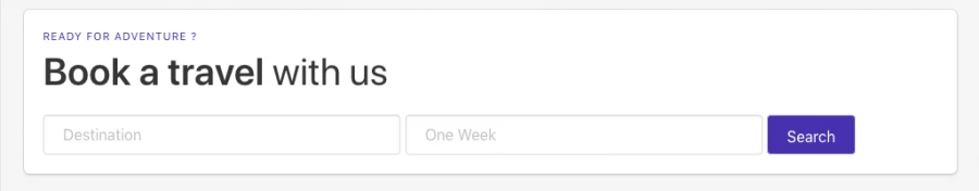
}Our Book a Travel Section
Here we will be using the Bulma box class, the button class and also the bulma input class.
The box class is a nice looking container with a shadow, a border, a radius, and some padding.
<div class="box">
       <!-- your code -->
 </div>
The bulma button class is used to style a button. It gives the button a nice visual look.
<button class="button">test</button>The input class is used to style the input element directly. Generally the input element is wrapped in a control class. The control class is the wrapped into a field class
<div class="field">
        <div class="control">
   <input class="input is-primary" type="text" >
 </div>
</div>
Now we go code our book travel section like this
 <div class="section ">
        <div class="box">
            <h1 class="heading ready">Ready for adventure ?</h1>
            <h1 class="title is-2">Book a travel <span class="span-text">with us</span> </h1>
            <form>
                <div class="field">
                    <div class="control">
                        <input type="text" class="input my-input" placeholder="Destination">
                        <input type="text" class="input my-input" placeholder="One Week">
                        <button class="button Search">Search</button>
                    </div>
                </div>
            </form>
        </div>
    </div>
The are some custom classes like my-input, ready and search
.my-input{
    display: inline;
    width:40%;
    padding: 20px 20px;
}
.Search{
    background-color: #4829b2;
    color: #fff;
    padding: 10px 20px 30px 20px;
}
.ready{
    color: #4829b2;
}
Now our book travel system looks like this
Finally we have finished our body section we have to work now on our footer
We would use the Bulma footer class for creating our footer. You will also see that we have the is-3 class in our code it is used to tell the column that is will occupy 3 grids of the 12 grids.
<div class="column is-3"></div>The Bulma Footer class
<footer class="footer"> your footer code</footer>Our footer code should be like this
  <footer class="footer">
        <div class="container">
            <div class="columns">
                <div class="column is-3">
                    <h1>TV monde 237</h1>
                    <h1>TV monde 237</h1>
                    <h1>TV monde 237</h1>
                    <h1>produced by Mista_Zidane at Seven Advanced Academy CMR</h1>
                </div>
                <div class="column is-3">
                    <h1>TV monde 237</h1>
                    <h1>TV monde 237</h1>
                </div>
                <div class="column is-3">
                    <h1>TV monde 237</h1>
                    <h1>TV monde 237</h1>
                </div>
                <div class="column is-3">
                    <h1>Follow Us</h1>
                    <p>Facebook</p>
                    <p>twitter</p>
                    <p>instagram</p>
                    <p>Linkedin</p>

                </div>
            </div>
        </div>
    </footer>
We would need to do some styling so our custom css will look like this.
.footer{
    background-color: #4829b2;
    color: rgb(236, 234, 234);
}
Wow you should be proud of youself for learning the basic concepts in Bulma, You can start building responsive sites now with Bulma.
Thank you for staying with me up till the end. I hope this post was helpful? feel free to comment below if you have any trouble. I will realy apreciate if you follow me.

ntokungwia zidane
I trust in knowledge sharing and love sharing my knowledge with others.


- 7 years ago
learn how to setup angular 7 and firebase

Save Your Money Today!

By receiving free stock articles and smart tutorials to advance your career.


Save Your Money Today!
By receiving free stock articles and smart tutorials to advance your career...